Create dashboards
With dashboards you can create tailored collections of charts for tracking metrics that matter most to your application.
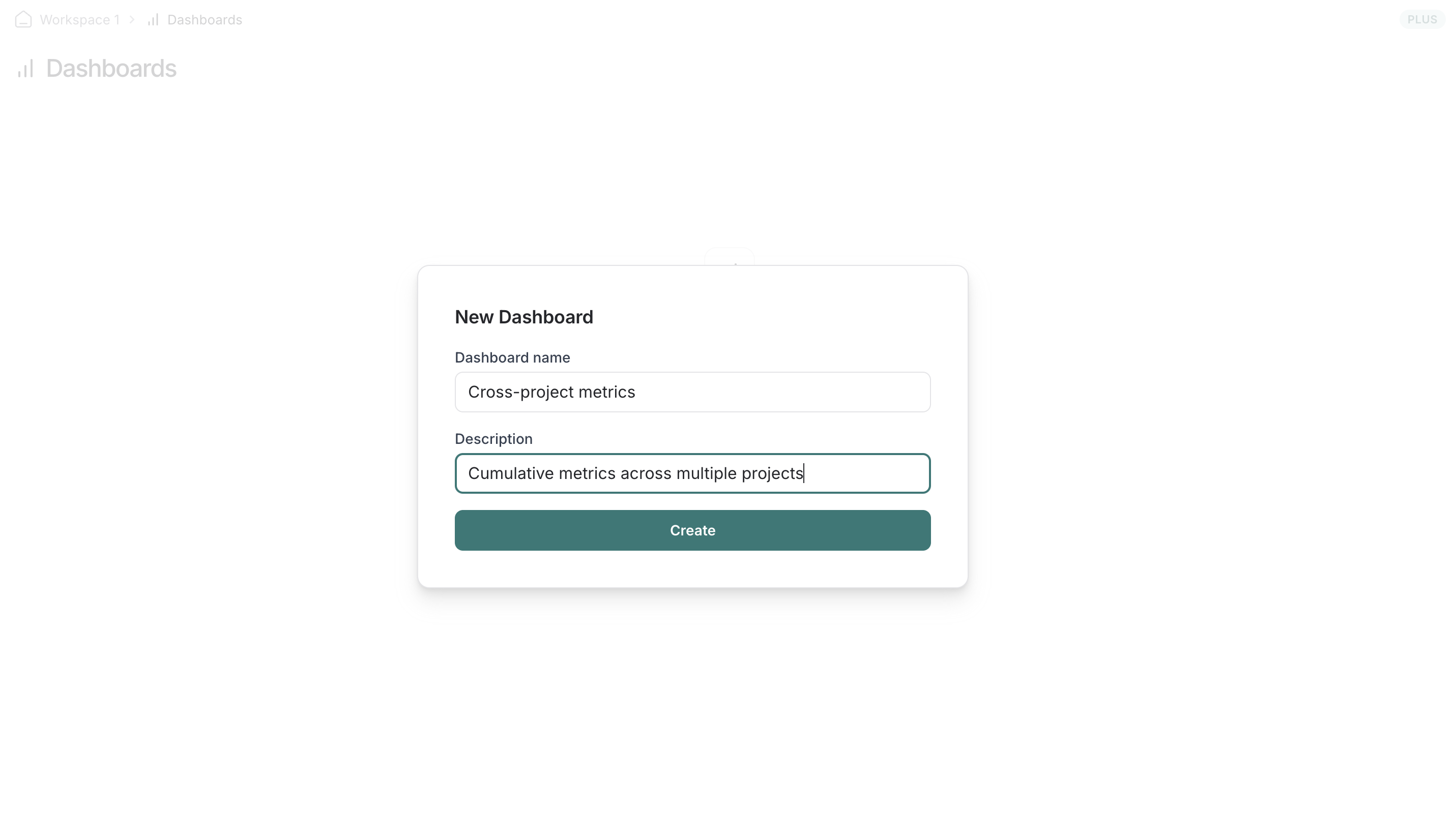
Creating a new dashboard
- Navigate to the
Dashboardstab in the left sidebar. - Click on the
+ Dashboardbutton. - Give your dashboard a name and a description.
- Click on
Create.
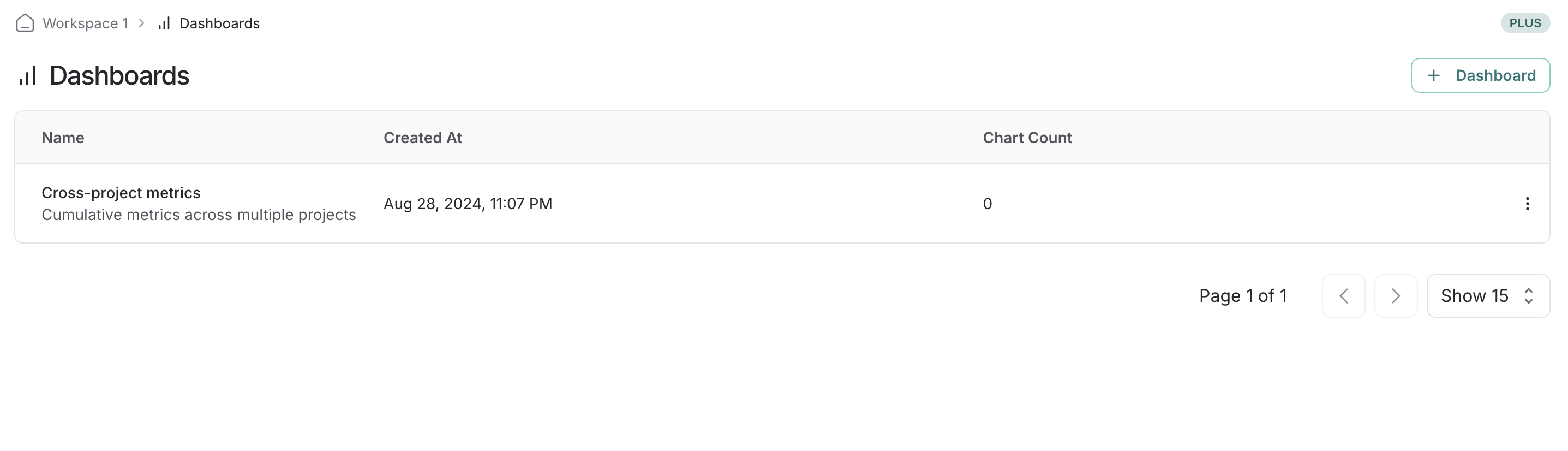
You'll see all of your dashboards displayed in a table view.
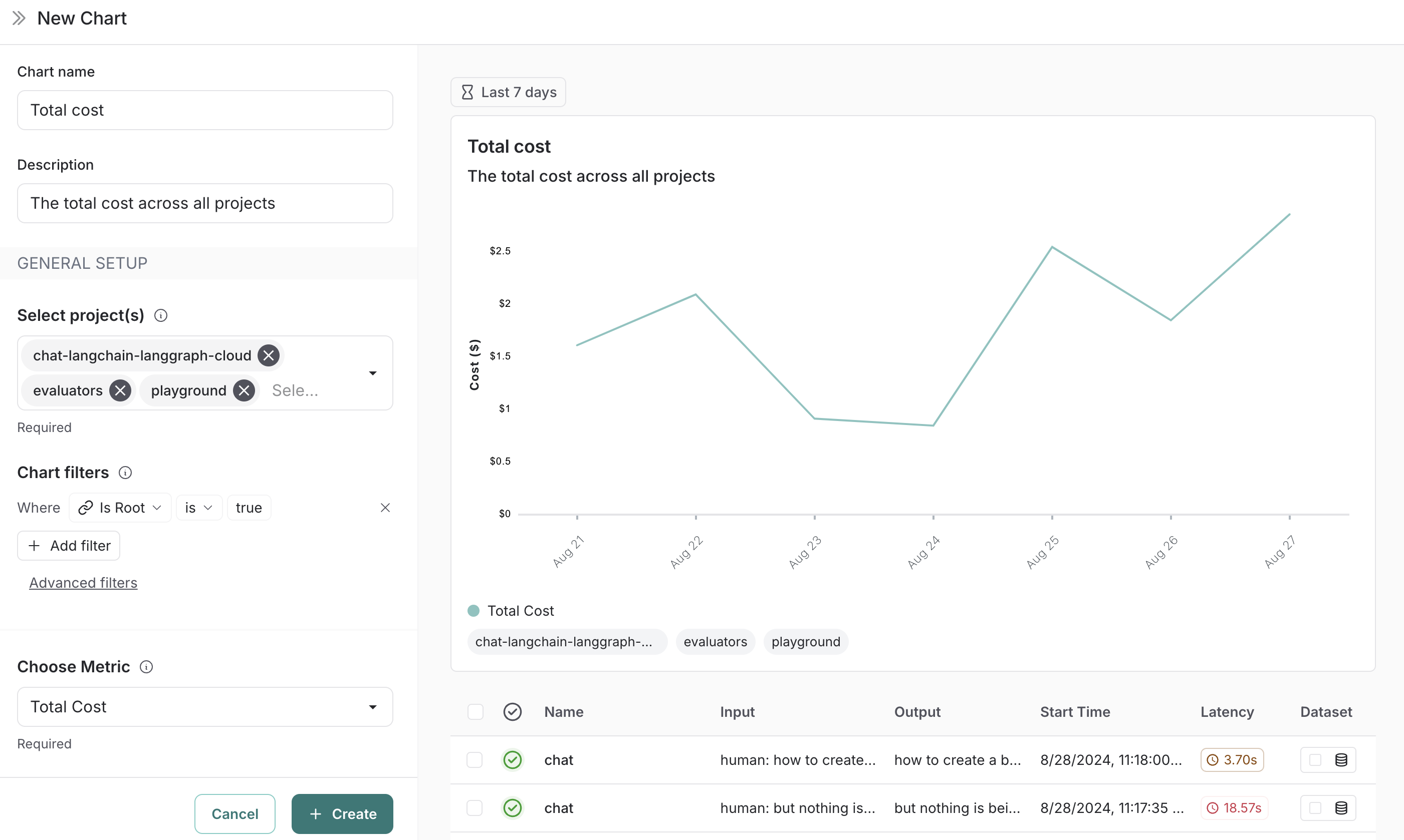
Adding charts to your dashboard
- Within a dashboard, click on the
+ Chartbutton to open up the chart creation pane. - Give your chart a name and a description.
- Select one or more projects to track metrics for.
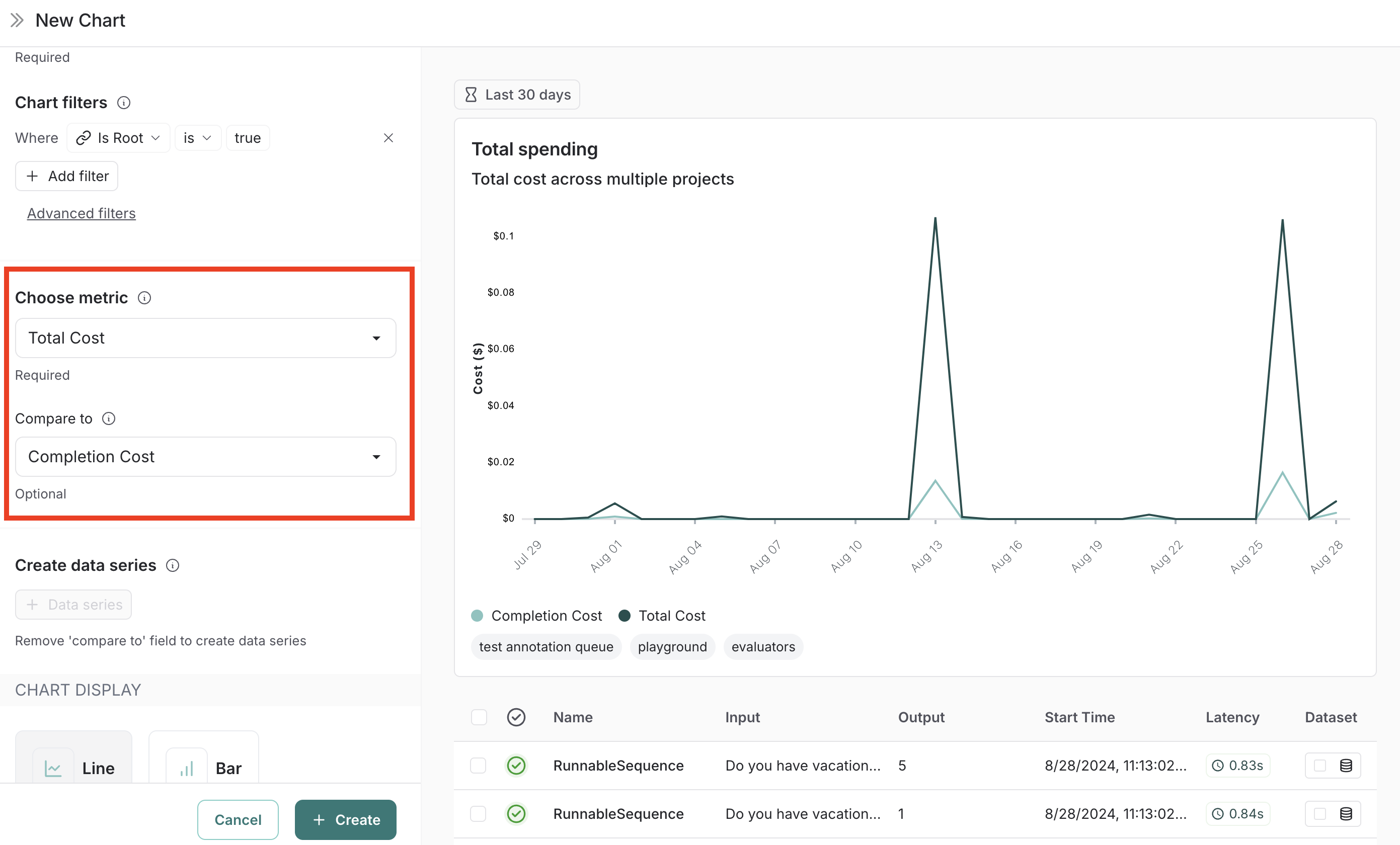
- Choose a metric from the dropdown menu to set the y-axis of your chart.
With a project and a metric selected, you'll see a preview of your chart and the matching runs.
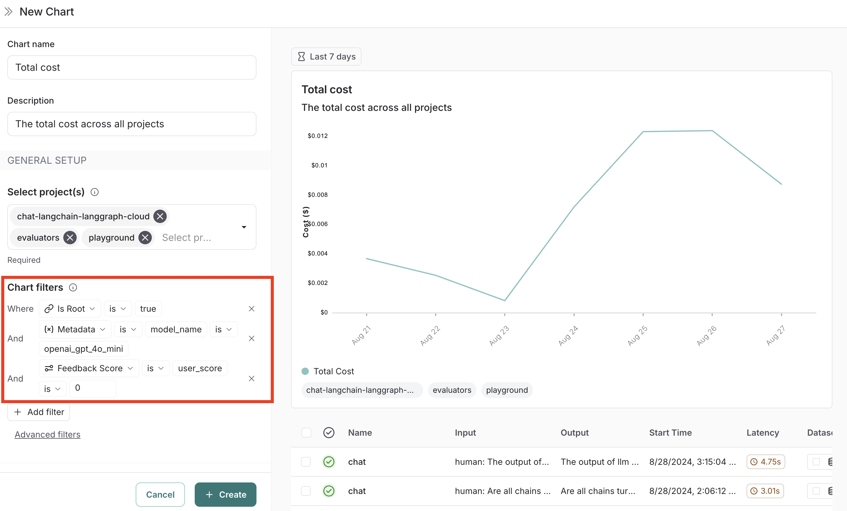
Filtering traces in your chart
Use the Chart filters section to refine the matching runs. These are the same filters available on the Projects page and apply to all data series in the chart. (See Filter traces in application for more information on filtering traces.)
Comparing data within a chart
There are two ways to compare data in a chart (i.e. create multiple lines in a chart):
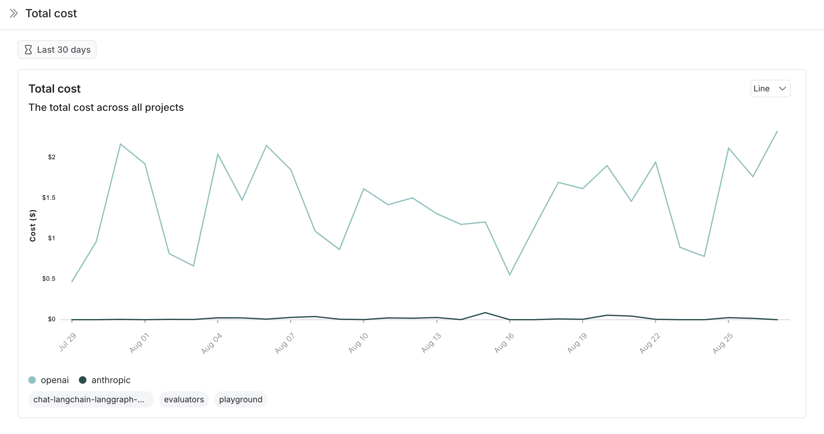
- Multiple metrics: Add multiple metrics with the same unit to a single chart. Each metric appears as a separate line. For example, compare P99 with P50 latency. When you pick an initial metric, the comparison metrics dropdown will only show metrics with the same unit.
Or
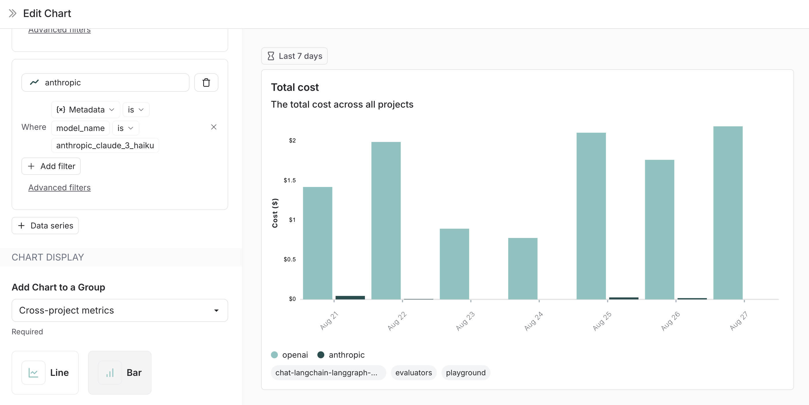
- Data series: Create multiple data series within a chart, each with its own filters. This is useful for comparing granular data within a single metric. An example of using data series is to compare the performance of two different models or configurations. Name each series and apply specific filters.
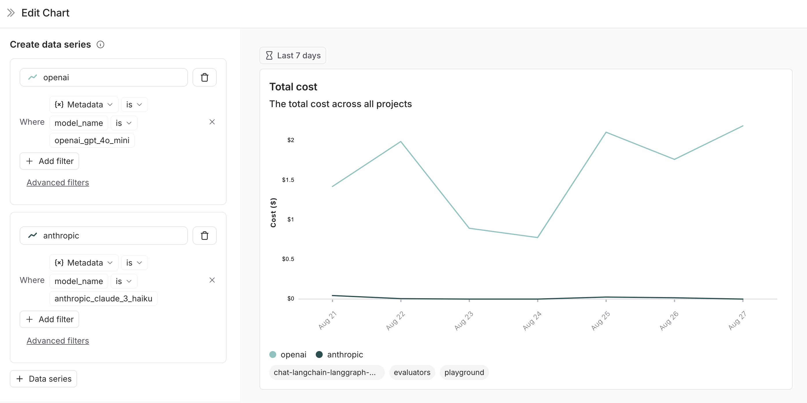
Chart display options
- Choose between a line chart and a bar chart for visualizing (you can toggle this within the dashboard view)
- Optionally reassign the chart to a different dashboard
Saving and managing charts
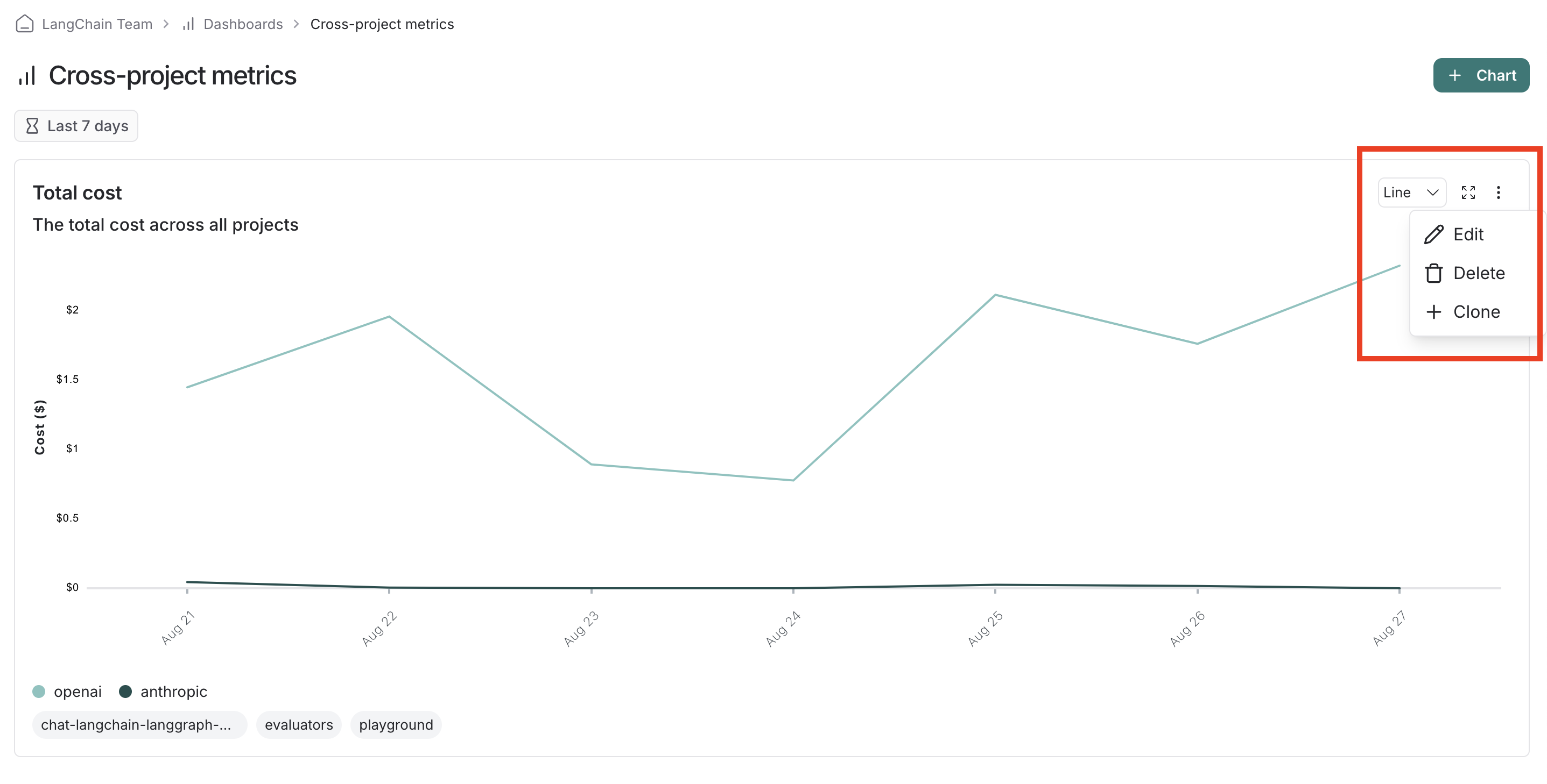
- Click
Saveto save your chart to the dashboard. - Edit or delete a chart by clicking the triple line button in the top right of the chart.
- Clone a chart by clicking the triple line button in the top right of the chart and selecting
+ Clone. This will open a new chart creation pane with the same configurations as the original.
View a chart in full screen
Click the expand icon in the top right corner of a chart to view it in full screen. This view offers:
- Greater detail on individual runs contributing to the chart data.
- The ability to change the time range of the chart.
User journeys
- Use monitoring charts for mapping the decisions made by an agent at a particular node.
Consider an email assistant agent. At a particular node it makes a decision about an email to:
- send an email back
- notify the user
- no response needed
We can create a chart to track and visualize the breakdown of these decisions.
Creating the chart
Metric Selection: Select the metric
Run count.Chart Filters: Add a tree filter to include all of the traces with name
triage_input. This means we only include traces that hit thetriage_inputnode. Also add a chart filter forIs Rootistrue, so our count is not inflated by the number of nodes in the trace.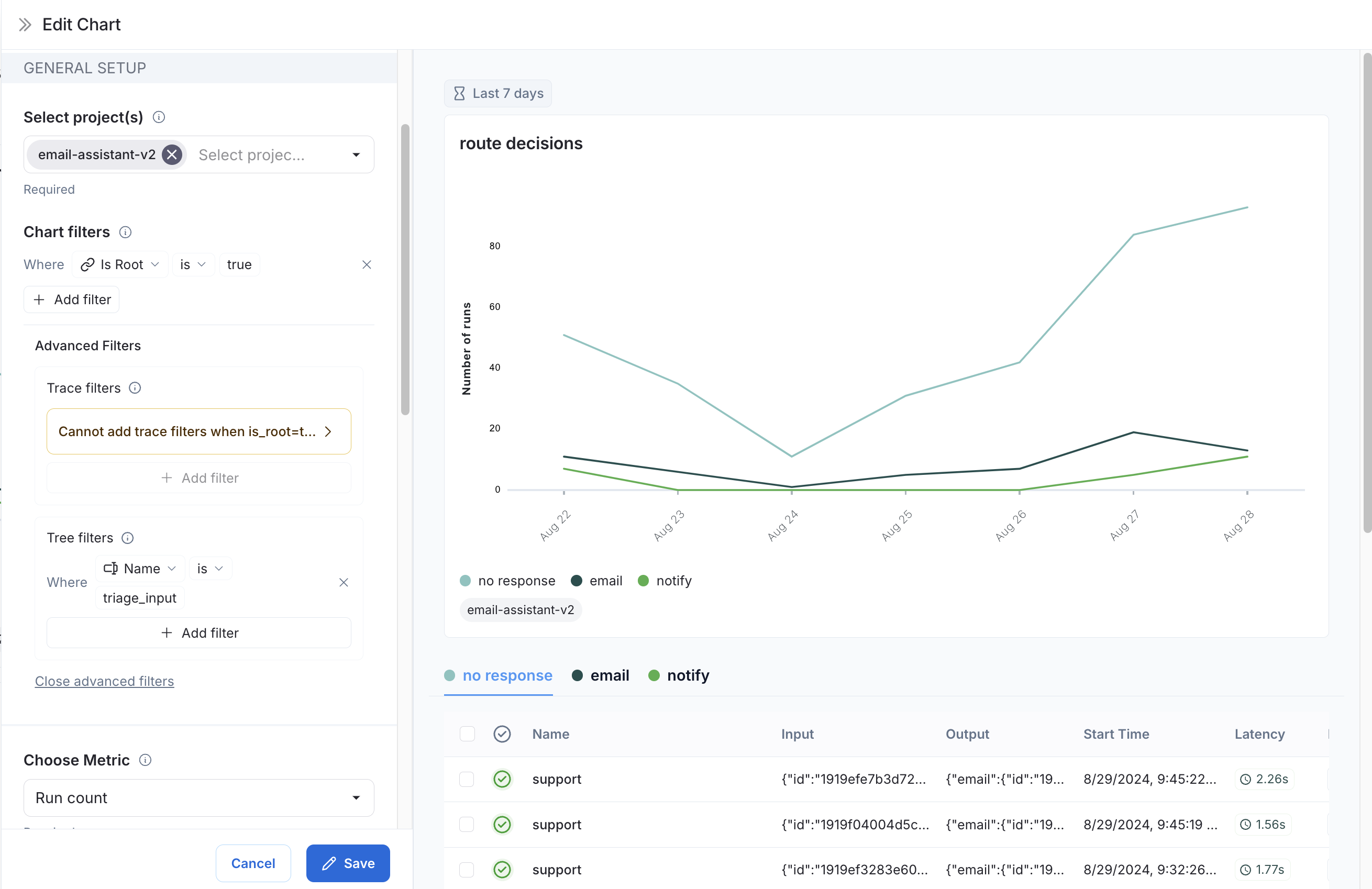
Data Series: Create a data series for each decision made at the
triage_inputnode. The output of the decision is stored in thetriage.responsefield of the output object, and the value of the decision is eitherno,email, ornotify. Each of these decisions generates a separate data series in the chart.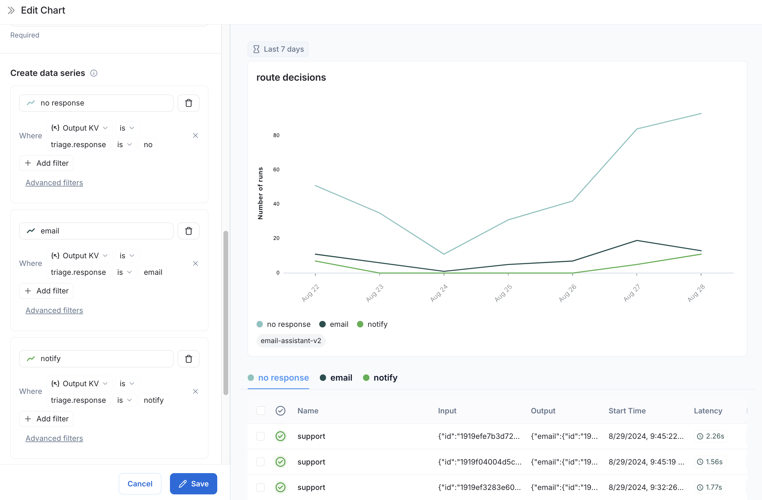
Now we can visualize the decisions made at the triage_input node over time.